
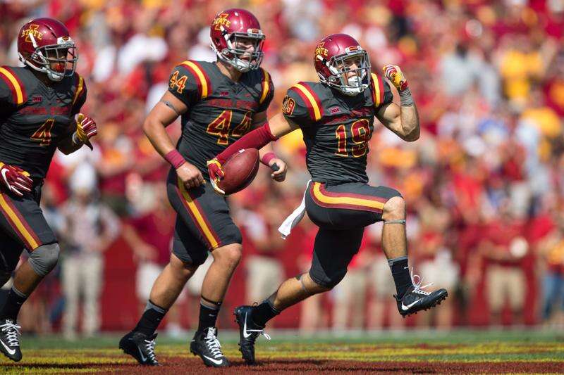
The only thing that should color wise change is the helmet color. Why is the red on the helmet a darker shade of red than the red on the jerseys? It looks a little silly. It’s why I prefer when we wear white helmets.

The helmets and the jerseys are most likely supposed to be the same color of cardinal. But because of the difference in the materials and how they interact with/reflect light, they end up looking like different shades. Even the gloves look like a lighter shade in this picture.View attachment 99324
The only thing that should color wise change is the helmet color. Why is the red on the helmet a darker shade of red than the red on the jerseys? It looks a little silly. It’s why I prefer when we wear white helmets.
Regardless of the intention of how it should look, the color just doesn’t look right. I feel like our red helmets could pop a lot more. The red helmet used to really stand out back when we wore the Cy helmet.The helmets and the jerseys are most likely supposed to be the same color of cardinal. But because of the difference in the materials and how they interact with/reflect light, they end up looking like different shades. Even the gloves look like a lighter shade in this picture.
Either that, or its a manufacturer thing. Maybe Riddell and Nike have ever so slightly different shades of cardinal. You wouldn't think that would be the case, but that wouldn't surprise me either.

IMO, the helmet color is fine with the current cardinal jersey/pant. Try to find a team or two for which the helmet appears slightly lighter than the intended look. That looks much worse.View attachment 99324
The only thing that should color wise change is the helmet color. Why is the red on the helmet a darker shade of red than the red on the jerseys? It looks a little silly. It’s why I prefer when we wear white helmets.
That cool. It's your opinion and nothing wrong with that.Regardless of the intention of how it should look, the color just doesn’t look right. I feel like our red helmets could pop a lot more. The red helmet used to really stand out back when we wore the Cy helmet.
I hate to break it to you, but the 49's used ISU colors when they established their colors. Don't think we ever had yellow until earl.Hate the people calling it Ketchup and Mustard, that is a Squawk thing. Do they say the same about USC, Arizona, Minnesota, etc. blah blah. Its fine for butt hurt squawks to say it, but when our own fans say it I just want to wash their mouths out with cow $#!+. If you don't like our colors then I don't know what to tell ya other than deal with it.
I like both types of gold styles, really, but I if you are going to go with actual gold, metallic gold, I can't stand the tan gold of teams like Boston College or San Fran 49ers. It needs to be more true gold more like Notre Dame have had some years, only without the glitter look, or the mirrored yellow gold that we have on some of our I-State Foil style decals.
I have always liked our Yellow/gold helmets of the 80s and staying with our other uni color scheme would make the most sense as you would need to change all the gold otherwise to this tan gold ugly color. But adding a true yellow metallic gold would be ok to if it was the right gold.
If we were to go with a metallic gold it would need to be similar to the gold in the I-State/stripe, ND helmet or visor below, not the San Fran or BC tan gold.
View attachment 99292
View attachment 99290
View attachment 99289
View attachment 99286
I think like others pointed out it is because of the flatness of the uni vs the glossiness of the helmet etc. One way this could be adjusted is to make the helmets in flat paint as some have, instead of glossy, but that may make them difficult to keep looking good. Shutt has a series of flat colored helmets, here is one in "cardinal".View attachment 99324
The only thing that should color wise change is the helmet color. Why is the red on the helmet a darker shade of red than the red on the jerseys? It looks a little silly. It’s why I prefer when we wear white helmets.

View attachment 99330
I’ll say it again though, I’d do unspeakable things for this uniform combination.
So this all came up in a different thread yesterday. If you look at the most recent ISU Style guide, Iowa State officially uses 4 different shades of Cardinal and 3 different shades of Gold. I was surprised to learn that the darker colors in the 4-color "I-State" logo are considered our actual colors. It isn't instantly clear which part of the bevels are the official colors, and which are highlights/shading. And that is why I am with you completely on ditching the bevel and making the 2-color, and 1-color(stencil) logos our primaries.I think there has been some problems with all the different shades of cardinal used. Some of the manufacturers us what the University uses, some use what the AD uses, then some mistakingly use the accent/shadow cardinal color that is for the bevels as the primary cardinal. Not to mention we have a history of updating the color palette every few years, so there is a huge variance of all things Cyclones out there in all kinds of different shades of Cardinal.
For this reason I really think they need to get together, eliminate the 2 different palettes, and eliminate the shadow shades. Come up with 1 shade of Cardinal and one shade of Gold. And possibly one shade of each in a chrome/metallic style to match the standard palette as close as possible.
This would also eliminate the beveled logos, and stick with the 2 color or 1 color styles.

We did the matte cardinal helmets a while ago (this is from 2014). But the beveled "I-State" having to be a glossy sticker spoils the look. If we could do the stencil logo on matte I think it would look better, take the Commanders new helmets as a reference.I think like others pointed out it is because of the flatness of the uni vs the glossiness of the helmet etc. One way this could be adjusted is to make the helmets in flat paint as some have, instead of glossy, but that may make them difficult to keep looking good. Shutt has a series of flat colored helmets, here is one in "cardinal". View attachment 99335


Ugh ... those should have been nixed at the drawing-board stage. Or possibly before that.These were an incredible failure -- especially for people whose job includes having to read the numbers (radio, TV, statisticians, etc.). Changing the jersey color to black wouldn't help that.
Like it or not, ISU has finally achieved some baseline respect nationally, and it was done using the IState logo. (Vegas is unanimously penciling us in for 7ish wins after losing nearly every well known player.)Color scheme is fine. We just need to change our logo. The I State logo looks like a crop insurance company.
I also just prefer our white/black helmets personally. The red helmet is a gripe of mine but I more want a logo change above anything else. I just think it’s time after having this one for over a decade now.That cool. It's your opinion and nothing wrong with that.
The idea of thinking that changing our logo will cost us future success is a prime example of the loser mentality we had before Matt Campbell come along. (Campbell coined a nice term for these kind of programs)Like it or not, ISU has finally achieved some baseline respect nationally, and it was done using the IState logo. (Vegas is unanimously penciling us in for 7ish wins after losing nearly every well known player.)
To change the logo now CAN ONLY serve to risk forfeiting the progress ISU has made in the minds of those outside our little world.
I'm all for making improvements to our look, but they need to be done within the confines of largely staying true to our existing logo.
In hindsight I now realize now just how much I disliked the Paul Rhoads/ early MC era uniforms.These were an incredible failure -- especially for people whose job includes having to read the numbers (radio, TV, statisticians, etc.). Changing the jersey color to black wouldn't help that.
I hate to break it to you, but the 49's used ISU colors when they established their colors. Don't think we ever had yellow until earl.


