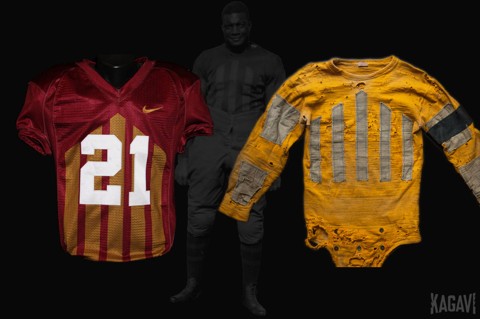
New Uniforms Revealed

Draf

Well-Known Member
Jun 8, 2017
180
722
93
53

Draf

Well-Known Member
Jun 8, 2017
180
722
93
53
I believe 1978 was the same as 1977 (no UCLA piping / varsity stripes) for regular season, but am not sure (I was only 8 at the time). 1979 photo is attached, showing same color scheme w/ new logo for that year. Jersey numbers are gold. 1979.jpg
 

Land Shark

Well-Known Member
Apr 6, 2006
754
1,107
93
I believe 1978 was the same as 1977 (no UCLA piping / varsity stripes) for regular season, but am not sure (I was only 8 at the time). 1979 photo is attached, showing same color scheme w/ new logo for that year. Jersey numbers are gold. View attachment 71745
Donnie stayed with this jersey look his first two seasons and switched helmet logos his first three seasons. His teams looked pretty good minus the constant helmet changes
 

cyclones500

Well-Known Member
Jan 29, 2010
35,848
23,340
113
Michigan
basslakebeacon.com
Donnie stayed with this jersey look his first two seasons and switched helmet logos his first three seasons. His teams looked pretty good minus the constant helmet changes

For some reason, at the time, I thought the cardinal looked too maroon-ish compared to 76-78, but when I see photos of it now, they seem almost identical. Possibly I was distracted a little because there was "more red" because Duncan had switched to cardinal helmets so it was C-C-G and I was accustomed to gold/cardinal/gold - gold/white/gold. Hard to say. I definitely noticed the brighter red (and probably yellower gold) with Criner's changes.
 

67CY

Well-Known Member
Apr 13, 2006
4,125
2,829
113
Roger that. Every one has their opinion. Both are good. I think the throwbacks get a little darker shade than I might prefer, and think might make a possible return.

That's what I'm really hoping is for is a possible return to something close to that type of gold we've had in the past. Now the Stapleton era gold is another story, haha.
I thought the Stapleton era uniforms looked good. It would be nice to see a good colored photo of the actual C&G worn back then
 

BMWallace

Well-Known Member
SuperFanatic
Sep 11, 2011
1,318
2,378
113
Chicago, IL
Thought process, Orrnado helmet illustrated: Pic 1, @amestoplease Orrnado/Cyclone, Rt. side mirror image of Lt. (not intended this way but I wanted to see it). The mirror image on Rt. does not look good (maybe because we never see it this way!). I rounded the side points a bit, my preference but I like the sharper points too. Pic 2, shows the same Orrnado on both sides. I modified the cant, tilting the Orrnado backward to make it more level, more symmetry. Pic 3, modification of turning the bottom tip of Right-side Orrnado to point rearward. I like this a little better, also gives a bit more symmetry. Now both Ornado/Cyclones have the illusion of moving forward.
View attachment 71413 View attachment 71414 View attachment 71415
Not sure if anyone would go for it, but I was curious if there any way to work the Orrnado into the helmet similar to the Oregon duck wing helmets, or like the Eagles/Vikings helmets.

I tried to do my own jank version, but I'm sure someone else could make it look way better than I did. upload_2020-5-6_17-14-25.png
 

t-noah

Well-Known Member
Feb 2, 2007
16,913
10,705
113
Not sure if anyone would go for it, but I was curious if there any way to work the Orrnado into the helmet similar to the Oregon duck wing helmets, or like the Eagles/Vikings helmets.

I tried to do my own jank version, but I'm sure someone else could make it look way better than I did. View attachment 71754
Not bad. As Colonel Clink would say, “Very interesting!” Or was that Arte Johnson?!
 
Last edited:

t-noah

Well-Known Member
Feb 2, 2007
16,913
10,705
113
I thought the Stapleton era uniforms looked good. It would be nice to see a good colored photo of the actual C&G worn back then
I should have clarified that I liked them also. It’s just that it goes to a whole nother level of gold!
It’s amazing really if you just start say at the Stapleton era unis, and go to recent times, how much things changed, and not for the better.
 

bgprest

Well-Known Member
Aug 18, 2008
857
504
93
Dallas, TX
Not sure if anyone would go for it, but I was curious if there any way to work the Orrnado into the helmet similar to the Oregon duck wing helmets, or like the Eagles/Vikings helmets.

I tried to do my own jank version, but I'm sure someone else could make it look way better than I did. View attachment 71754


Not a bad idea at all. I'm thinking a gold or white face mask might improve it a little.
 

Cy37

Member
Jan 1, 2018
55
47
18
30
I like these a little better, the white pant with full stripe and black I-State/Swoosh for several reasons. I think it is more classic and goes better w/ other combos. And I like the gold number with white trim jersey better than white number. Like both but again the gold number goes better with other combos IMO. Note: I would like them to keep two cardinal jerseys, both are here in this post. I think that would give them great flexibility.
View attachment 71389 View attachment 71390 View attachment 71391


Love this one with white or red pants. Perfect
 

Attachments

  • 3B547064-DB19-45E2-A134-1439C974ECE2.jpeg
    3B547064-DB19-45E2-A134-1439C974ECE2.jpeg
    111.4 KB · Views: 33

Sigmapolis

Minister of Economy
SuperFanatic
SuperFanatic T2
Aug 10, 2011
25,021
37,101
113
Waukee
Amateur Photoshopping here, but is this closer to the "sunflower" gold? Also added cardinal socks (admittedly sloppy and a bit to fire-engine-ish, if someone could do a better one with those socks instead of gold, I'd like to see the full unit).

View attachment 71737

That is a million times better with cardinal socks instead of making it look like a golden pair of yoga pants/a golden leotard when the pants and socks match.

Even a relatively neutral color (e.g., white or black) would be better.

I think that looks pretty good -- but I would prefer a cardinal mask with it.
 
  • Like
Reactions: cyclones500

cyclones500

Well-Known Member
Jan 29, 2010
35,848
23,340
113
Michigan
basslakebeacon.com
That is a million times better with cardinal socks instead of making it look like a golden pair of yoga pants/a golden leotard when the pants and socks match.

Even a relatively neutral color (e.g., white or black) would be better.

I think that looks pretty good -- but I would prefer a cardinal mask with it.

Definitely cardinal mask is necessary with that get-up. I didn't attempt it because my limited skill I thought it'd look worse.
 

Sigmapolis

Minister of Economy
SuperFanatic
SuperFanatic T2
Aug 10, 2011
25,021
37,101
113
Waukee
Definitely cardinal mask is necessary with that get-up. I didn't attempt it because my limited skill I thought it'd look worse.

Yeah, it looks good. Thank you for that.

I know Campbell is anti-gold, and he was at Toledo, too.

But having a set of gold pants and/or a gold helmet would be really easy and pair well with the existing cardinal and white assets that we have.

G/C/G
C/C/G
G/W/G
C/W/G
etc.

= would all look really nice in the rotation.

I know a gold football jersey is controversial around here (even if I like it, but not as much as I love the one for the basketball team), but you do not need to do that.

Oh well.
 

t-noah

Well-Known Member
Feb 2, 2007
16,913
10,705
113
Amateur Photoshopping here, but is this closer to the "sunflower" gold? Also added cardinal socks (admittedly sloppy and a bit to fire-engine-ish, if someone could do a better one with those socks instead of gold, I'd like to see the full unit).

View attachment 71737
Always love to see some photoshop work. I know that gold is a very hard shade to get right, even if you have the color shade in mind. The more I do PhotoEditing the more I realize how difficult it is to get a correct shade, particulary Gold for us Cyclones!
 
  • Like
Reactions: cyclones500

t-noah

Well-Known Member
Feb 2, 2007
16,913
10,705
113
One of the recent gold shades I did, this one, CyUni 2030  c12y A17bW wbY 28- y r y RdfaceRRB PGSksYWG8Sl.png , I really thought I had the sunflower or '76 gold shade down. I probably took it from pic of gold helmet in Earl Bruce era. I realize now that it is too red/orange. It took many takes to get that shade. My latest effort to get close to our historical '67-'83 gold is here, CyUni 2020 c12y G7Sh4 wbY 28- y r y RedfaceRRB RedSks.png again after many takes/attempts. I think this second one better approximates our '70's and early '80's gold. ISU UnisGoldFrom1967-83 CircaDavidArcher.png
 

t-noah

Well-Known Member
Feb 2, 2007
16,913
10,705
113
Regardless it would be nice if we could return to that '67-'82 shade of gold we had, add it to our current colors. Maybe Campbell would then be more inclined to include a gold pant, helmet?
 

t-noah

Well-Known Member
Feb 2, 2007
16,913
10,705
113
Yeah, it looks good. Thank you for that.

I know Campbell is anti-gold, and he was at Toledo, too.

But having a set of gold pants and/or a gold helmet would be really easy and pair well with the existing cardinal and white assets that we have.

G/C/G
C/C/G
G/W/G
C/W/G
etc.

= would all look really nice in the rotation.

I know a gold football jersey is controversial around here (even if I like it, but not as much as I love the one for the basketball team), but you do not need to do that.

Oh well.
Quote: "I know Campbell is anti-gold, and he was at Toledo, too."

Do we really know this or are we just speculating? Could it be he does not like our current shade of gold? Would he be open to an addition of our historical '67-'82 shade of gold?

If the answer to that last question is "possibly" then the time might be right to consider it.
 

Sigmapolis

Minister of Economy
SuperFanatic
SuperFanatic T2
Aug 10, 2011
25,021
37,101
113
Waukee
Quote: "I know Campbell is anti-gold, and he was at Toledo, too."

Do we really know this or are we just speculating? Could it be he does not like our current shade of gold? Would he be open to an addition of our historical '67-'82 shade of gold?

If the answer to that last question is "possibly" then the time might be right to consider it.

I have two pieces of evidence for you.

(1.) The proof is in the pudding. Toledo is navy/gold and Iowa State is cardinal/gold, but both schools experienced a significant decline in gold elements as a part of their football kits once Campbell became the head coach of each program.

(2.) I think Campbell basically said it on a podcast with CW. I think CW has repeated a few times on podcasts and the radio show when the inevitable uniform conversations come up. I know I remember Campbell saying he loves black, too, and you can see that in his personal wardrobe, which presents complications considering black and gold is still something of a taboo for our athletic department and fan base.

The fact the redesign led to cardinal, white, and black elements -- like we are Louisville or something -- instead of gold a few years ago should tell you everything.
 
Last edited:

CYCLNST8

Well-Known Member
Jul 19, 2008
10,894
12,375
113
Urbandale
www.gimikk.com
Just need to periodically remind folks of how INACCURATE the Trice throwbacks were:

Trice-yellow-or-gold13.jpg


Carry on.