See some of Kagavi's articles on this very subject very interesting and great work!!!
These are some of the best logo's and best research I've seen on Iowa State.
http://www.kagavi.com/a-timeless-legacy/
http://www.kagavi.com/the-heritage-of-jack-trice-and-johnny-orr/
http://www.kagavi.com/adding-jack-trice-to-the-iowa-state-brand/
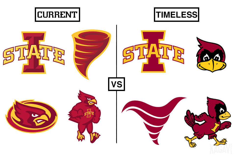
One of his works:
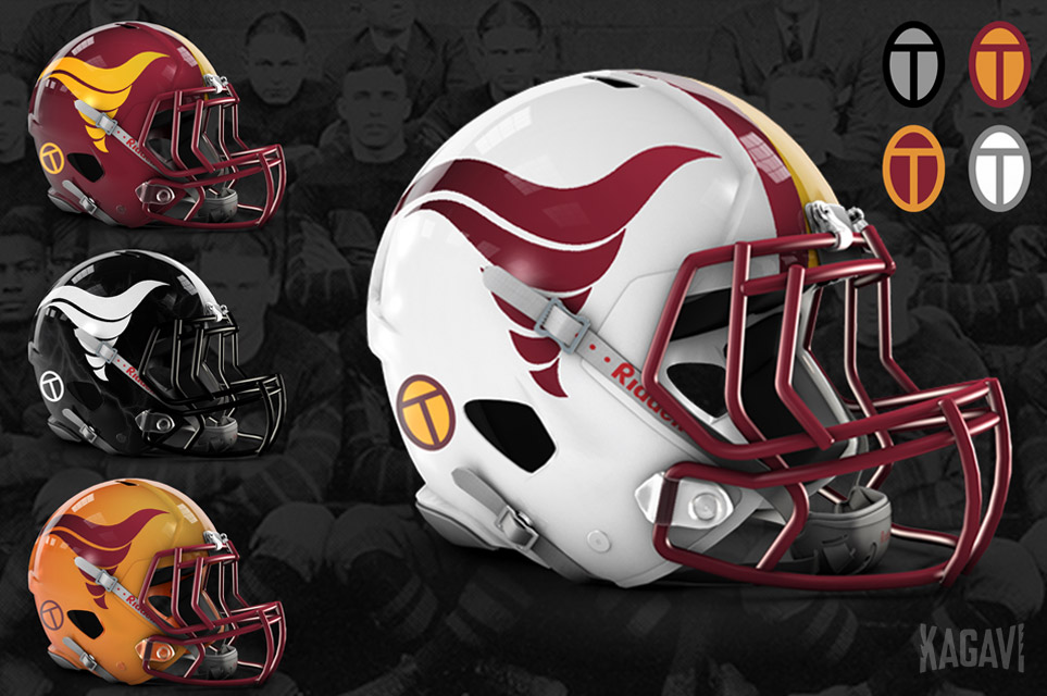
Try it with my modified Kagavi Orr-nado. The top of the old one always bothered me some: