I like the uniforms they wore for the Tech game last season.
Add some white accents on the jersey, tornado on the helmet and it's the ISU uni GOAT.

I like the uniforms they wore for the Tech game last season.
Add some white accents on the jersey, tornado on the helmet and it's the ISU uni GOAT.
These are the best uni's I've seen us wear....I wasn't around for the Ronald McDonald, ketchup and mustard, or the weird blue phase, but pictures of those are awful.
Well I think most us can agree the blue was a bad idea. I hated that from day one.
If you go back and do your research, you'll see that Iowa State has historically used ketchup & mustard far more than the god awful "true" gold some of you punks are so obsessed with. Watch & learn, junior:
I just hope that if we keep the double stripes on the shoulders we go back 4 years to them ending on the seam even with the neck line and not going into the armpit. VT still has these while LSU and Ole Miss are like ours.
As a fan I don't mind gray as a fan. What I don't like about last fall's gray is the nubby texture appearance of the jerseys. The weave looks heavy, like a gray sweatshirt turned inside out. A silky smooth gray rather than the dark nubby appearance would look better . . . imo, of course.
And now, for something completely different: consider black jersey with gray helmet and gray pants? Just a thought, and maybe a bad thought at that. Not sure. . . . Heck, we are talking about only one game for some of these combos, right?


I just hope that if we keep the double stripes on the shoulders we go back 4 years to them ending on the seam even with the neck line and not going into the armpit. VT still has these while LSU and Ole Miss are like ours.
those are awesome, and I love the numbers are white, looks so much better than the bright yellow numbers that contrast with the dark red we have on a base uniforms. The cardinal shade in these is spot on too.How can you not at least like the colors in these?

I just hope that if we keep the double stripes on the shoulders we go back 4 years to them ending on the seam even with the neck line and not going into the armpit. VT still has these while LSU and Ole Miss are like ours.
http://thespun.com/college-football/photos-lsus-uniform-looks-a-little-different?ads=offCompletely agree on the shoulder stripes. They should end at the seam.

The little box in the corner is helpfulUniforms are all in the eye of the beholder, as shown in this thread. I prefer traditional looks like K-State, OU and Texas. I loathe schools like Ku and Tech, running out there and I'm not sure who it is that's playing that day.
Much of this has to do with age, methinks. I remember the Dirty Thirty uniforms as an example of simple traditionals that represented ISU at its height. Gold pots, white numbers on cardinal jerseys, and gold pants. The Trice throwbacks look cool as well.
I must be the only one who thinks the Jack Trice throwbacks were not very good looking.Those #1 all time.
Current all white #2.
/list
Yadda yadda jim criner
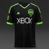
Why not go with it, if we insist on cardinal and yellow instead of Cardinal and gold#1 don't care what anyone says black and neon green is the best combo ever.
Might as well, I'd buy so much merchandise.Why not go with it, if we insist on cardinal and yellow instead of Cardinal and gold
I must be the only one who thinks the Jack Trice throwbacks were not very good looking.
I love that they tried to do something to honor JT, but didn't like the product.
2008ish?