
No forums found...
Site Related
Iowa State
College Sports
General - Non ISU
CF Archive
Install the app
CAMPBELL: Complete uniform/image overhaul coming
- Thread starter Kagavi
- Start date
No forums found...
Site Related
Iowa State
College Sports
General - Non ISU
CF Archive
You are using an out of date browser. It may not display this or other websites correctly.
You should upgrade or use an alternative browser.
You should upgrade or use an alternative browser.

I like the block I-State as well, but the funnel looks great on a helmet. Who says we have to use the same logo on the helmet every game?
I do. We have changed our symbol umpteen times. Stay with the I-State symbol and we will get some continuity with our identity. The A centers on the Big I. And IA happens to be the abbreviation for Iowa. Point that out repeatedly for those thinking Illinois State or Indiana State. The Funnel is recognized by Cyclone fans only for the most part. There is a reason why it was scrapped. Wasn't working and didn't really catch on.
Consistently use I-State Logo. Maintain some consistency in the Cardinal and Gold Colors going forward. Utilize the Gray uniforms and White Uniforms to mix things up. We need to get consistent identity in our primary logo. Which is why I consistently want that on our helmets. I actually like walking Cy for helmet stickers versus the newer image of Cy's head as our secondary symbol.
Are you new to uniform threads? I think the vast majority of us want to keep the I-State as primary logo. There are plenty of places to feature it besides the helmet:
50 yard line
Scoreboard
Gloves, Pants, Collar
Flags
Do you think Penn State, Notre Dame, Florida State, Ohio State, Navy, Michigan, or Alabama suffer an identity crisis because their primary logo isn't on the side of their helmet?
We need to stick with I-State as our primary Logo on our Helmets. Period. Actually like the White Helmets the best. No problem with stencil Logos.
Whirlybird and Criner Cyclone are fine for Retro Apparel. But not helmets and uniforms. Like the Walking Cy for Helmet Stickers.
No ketchup and mustard. Actually like the gray uniforms to mix things up. White Uniforms and White Helmets to mix things up as well.
this is exactly what im talking about. white helmets, just like every other school in the big12 and practically the country. white is not a school color. grey is not a school color. 'mix things up' does not need to be defined as incorporating colors that have nothing to do with your school just because it gives you options. pink uniforms and paisley uniforms would mix things up as well but i dont know why we would want that. you can appease the young generation of recruits who are attracted to the idea of different uni combos and stay on trend without abandoning your school colors. this kills me. you should be able to turn on a big12 game and reasonably quickly be able to identify the teams just by their uniforms, but now were to the point where just about any team could be decked out in all black or all white or anthrocite and mirror crap and the first glimpse of the demoted school colors you get are when the camera pans the crowd and you see a guy in a starter jacket from 1996.
this is exactly what im talking about. white helmets, just like every other school in the big12 and practically the country. white is not a school color. grey is not a school color.
white isn't a color for most sports teams and nearly every team has white on it. it's a neutral color - it just "is". no one thinks white uniforms are an "official" school color.
dodgers are consistently ranked as the best uniforms in baseball.
http://www.cbssports.com/mlb/news/best-uniforms-in-mlb-ranking-every-teams-2017-look-from-1-to-30/
yet white is not an official color of the dodgers. hmmm
http://www.glidden.com/Color/Team-Colors/MLB/Los-Angeles-Dodgers
Bring me Criner Cyclone or give me death
I'm liking the actual cyclone image more and more. It just seems so logical that we have a logo that is clearly identifiable as a Cyclone!
Various forms of Cy in logos are cool to many of us, but it doesn't make sense to anyone else. I don't want our branding to be so self-referential. If you just look at our logos, you could reasonable think we are the Cardinals.
Now, about that idea of having a tornado simulation on the field before games. That is a fantastic idea. Add some cardinal color to it and make it float around the stadium. I don't know how, but that is what we have a great engineering school for.
white isn't a color for most sports teams and nearly every team has white on it. it's a neutral color - it just "is". no one thinks white uniforms are an "official" school color.
dodgers are consistently ranked as the best uniforms in baseball.
http://www.cbssports.com/mlb/news/best-uniforms-in-mlb-ranking-every-teams-2017-look-from-1-to-30/
yet white is not an official color of the dodgers. hmmm
http://www.glidden.com/Color/Team-Colors/MLB/Los-Angeles-Dodgers
thats because there is a tradition of the home or away team wearing white jerseys in sports. iowa state is going to have white jerseys, just like every other school. i didnt say that white should be removed from all team logos or jerseys. if its a given that one team is going to be wearing white jerseys in whatever sport it is, you should differentiate yourself and show off your brand with your helmet design, for example. that article says the reason why the dodgers' unis are thought of so highly is because of the contrasting red numbers combined with the blue script word mark, not because of the white jersey. if their uniforms were so beloved simply because they were white, theyd have white helmets. hmmm.
Are you new to uniform threads? I think the vast majority of us want to keep the I-State as primary logo. There are plenty of places to feature it besides the helmet:
50 yard line
Scoreboard
Gloves, Pants, Collar
Flags
Do you think Penn State, Notre Dame, Florida State, Ohio State, Navy, Michigan, or Alabama suffer an identity crisis because their primary logo isn't on the side of their helmet?
Navy does have identity issues in some markets- their offensive style is more recognizable than the uniforms are. The other schools have all won multiple national titles so that is not exactly apples to apples.
Say no to the CrinerClone!! Stencil I-State, go for it!!
Reading through this thread is like sitting in a board room meeting where all the old people complain about whatever it is that they complain about while the new, fresh idea men, are pitching great stuff and getting poo pooed.
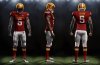
this one incorporates the stencil logo, trice stripes, and swirl logo. i cant decide if i like the idea of bringing the spirit of the trice stripes down to the socks for a little bit of an old school feel or not. if theres one thing that could be agreed on and embraced and utilized out of all this debate, i would really like to see the implication of the trice stripes on the sleeves. it unique, subtle, and important. i might even argue that its necessary.
Attachments
Those would be awesome with a gold pot.
Not sure how that's relevant. Are you a leprechaun?
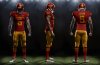
this one incorporates the stencil logo, trice stripes, and swirl logo. i cant decide if i like the idea of bringing the spirit of the trice stripes down to the socks for a little bit of an old school feel or not. if theres one thing that could be agreed on and embraced and utilized out of all this debate, i would really like to see the implication of the trice stripes on the sleeves. it unique, subtle, and important. i might even argue that its necessary.
As surly suggests, do that design w/ gold helmet, just to see how it looks.
As surly suggests, do that design w/ gold helmet, just to see how it looks.
And a yellow helmet with red pants, por favor.
Disagree. Everywhere I wear our I-State logo it's instantly recognized as Iowa State. New football unis, great, do it...but sweeping statements about "no identity" don't fly with me.
I would guess more so because of basketball success.
As surly suggests, do that design w/ gold helmet, just to see how it looks.
Attachments

And a yellow helmet with red pants, por favor.
albeit en español, i do appreciate your manners.
Attachments

this one incorporates the stencil logo, trice stripes, and swirl logo. i cant decide if i like the idea of bringing the spirit of the trice stripes down to the socks for a little bit of an old school feel or not. if theres one thing that could be agreed on and embraced and utilized out of all this debate, i would really like to see the implication of the trice stripes on the sleeves. it unique, subtle, and important. i might even argue that its necessary.
Thanks. I like these the best of any I've seen. I hope they get noticed by people that count. GOOD JOB!!!!!!!