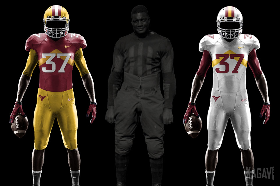
It seems like they can't ever get the colors right. I can't understand whyThat's what I was trying to get at. Forget what Kagavi's uniforms above look like, just trying to get the colors right.
I don't want us to look like anyone else, and he points out in his blog post about how our original colors are unique, but we need to be very true to those colors to make it work. Too much off, we look like FSU, BC, or even the 49ers.
The upside if we get it right though? Amazing. A unique look/color scheme that is ours alone and gives us more freedom to create unique uniforms combinations as well. Win win for everyone.

No forums found...
Site Related
Iowa State
College Sports
General - Non ISU
CF Archive
Install the app
CAMPBELL: Complete uniform/image overhaul coming
- Thread starter Kagavi
- Start date
No forums found...
Site Related
Iowa State
College Sports
General - Non ISU
CF Archive
You are using an out of date browser. It may not display this or other websites correctly.
You should upgrade or use an alternative browser.
You should upgrade or use an alternative browser.
just trying to get the colors right.
Like this?
Yes; I prefer these colors. Maybe a slightly more muted/darker gold. Matte helmet.
These are the best!another concept..
another concept..
Still think the chevron pattern needs to be carried over onto the pants as well, otherwise not a bad look!
View attachment 47890
I would love if they went with this concept.
Best New Look I Have Seen Anywhere!!
Best New Look I Have Seen Anywhere!!

This is one of my favorites as well. I like white highlights. Would love to see this with red pants...
Looks nice but ditch the tornado on the helmet - put on the ISU logoBest New Look I Have Seen Anywhere!!
Looks nice but ditch the tornado on the helmet - put on the ISU logo
I say we ditch you, @CycloneBob

Something about this just looks off to me.Best New Look I Have Seen Anywhere!!
Maybe it's the gold helmet with red jersey.
Maybe it's the ugly, outdated yellow surrounded by white shoulder stripe.
But I do like the pants.
Those colors are very close to those worn by Stapleton's teams, and I think were and still would be the best for Cyclones.another concept..
Does anybody have any information or a picture of the original cardinal and gold cloth that defines our school colors? Aren't they in Special Collections in Parks somewhere?
These are OUTSTANDING. Get MC on the emailer stat!another concept..
Does anybody have any information or a picture of the original cardinal and gold cloth that defines our school colors? Aren't they in Special Collections in Parks somewhere?
The actual school colors:

@CYCLNST8
Happy happy joy joy!
Thank you.
So it is a Cyclones.tv video.
Anybody know which one of them it would be?
Time to fire up that subscription...
I think getting our colors right back to that original, once and for all, should be paramount, but just looking at it, I think we are actually close (if not perfect) right now.
Sucks for the "khaki-gold" lovers, though, given that looks more like the yellow-gold.
@CYCLNST8
Happy happy joy joy!
Thank you.
So it is a Cyclones.tv video.
Anybody know which one of them it would be?
Would you be kind enough to link to the gold color tweets you're referring to and also some of the other hints?

Please blow my mind and tell me that Kagavi is on the design team! That would be awesome.
Not me, but Amestoplease should be with his updated Cyclone logo.
I think getting our colors right back to that original, once and for all, should be paramount, but just looking at it, I think we are actually close (if not perfect) right now.
I love the history behind those two scraps of fabric, yet actual execution was all over the map. Gold sometimes appeared as gold, sometimes yellow. No rhyme or reason to it, just purely availability of fabrics. Generally speaking, I have seen more references to gold versus yellow in surviving memorabilia from the earliest days. Evidence of this can be seen in ISU Alumni Center memorabilia from an ancient story I did from 2013. Pretty pictures here:
As far as red and yellow go, there is one iconic college team that is known for that combo (hint: not ISU). Look at it from a purely business and branding perspective for the next 100 years. Why did ISU change back to the yellow color of the University of Iowa after decades of using true gold? True gold is undeniably more sophisticated, yet Jack Trice wore yellow and so did other ISU icons such as Fred Hoiberg, Dan Gable, and Johnny Orr.
To keep the "rebrand" as timeless as possible:
Step 1: Keep I-STATE as school logo and Cy as mascot logo.
Step 2: Designate solid color/stencil I-STATE logo as primary, relegate beveled for special needs only.
Step 3: Add back updated Cyclone logo as MISSING nickname logo.
Step 4: Make color scheme more unique by choosing from options below:
Step 2: Designate solid color/stencil I-STATE logo as primary, relegate beveled for special needs only.
Step 3: Add back updated Cyclone logo as MISSING nickname logo.
Step 4: Make color scheme more unique by choosing from options below:
A - Keep current cardinal and yellow, substitute white with light gray (aka STORM) as third color. (White kept as alternate neutral.)
B - Keep current cardinal, switch yellow with true gold. (White and light gray used as needed.)
(Note: in either choice, the "losing" gold/yellow color could still be used for some alternate uniforms across all sports, but not as the official school colors.)
Step 5: Do many more throwbacks and faux-backs utilizing old logos, etc. Really take advantage of the unique Cyclones nickname, both in color and scheme.B - Keep current cardinal, switch yellow with true gold. (White and light gray used as needed.)
(Note: in either choice, the "losing" gold/yellow color could still be used for some alternate uniforms across all sports, but not as the official school colors.)
Kagavi liked the “I” sweater or jersey worn by the son, Wayne Frake, in the 1945 Rogers and Hammerstein version of the movie State Fair.
I don't know whether it was official ISU wear, but before, Kagavi thought it possible that someone just called Iowa State up and had it shipped, rather than the studio making it in-house. The color scheme is interesting and includes grey elbow reinforcements. Per a comment I saw last year on YouTube, the color in the film won't degrade or change much if at all as it was filmed in (expensive) technicolor. So the colors should still be true and match the originals.
Sorry, but I am not certain how to link to a particular point in the film via my phone. You can see Wayne in the sweater at the following points, with the biggest shots of it towards the end of the first segment, and at the beginning of the second:
11.20 - 12:40
14:25 or so
Here was one of the old thread concepts with the stencil logo:
(I believe this is an "amestoplease" original : )
View attachment 47886
I go way back and never have seen ISU look better than during the Dirty Thirty days, which these resemble. That's tradition that most youngsters don't even know existed. But it was a classic look nonetheless with the gold pots, cardinal jersey and gold pants. As a boy growing up in Sioux City, I dreamed of watching Clay's squad someday. ISU unies have been trash ever since. So there!
You know how we could easily distance ourselves from USC? Yellow helmets & red pants. Boom.
(All white on the road)
(All white on the road)