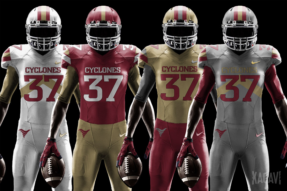
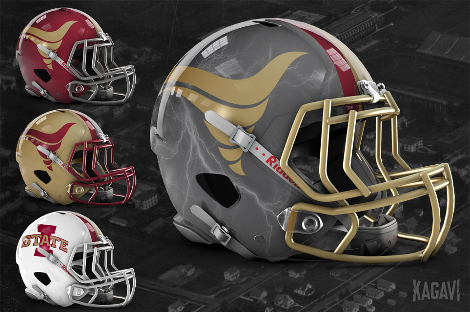
If it's Cyclone Uniforms, they're undoubtedly purely conceptual. Stencil on gold looks decent (seems to be a little "empty," though). Overlapping ISU has historic connection. Don't like the lower two. Nice try with the state-of-Iowa, but that has too little contrast and would look like a blob to anyone viewing from beyond 25 feet. Don't like oversized logos, so swirly Cy is out for me.